Client:
EmpowerID
Type:
Web Site
Discription:
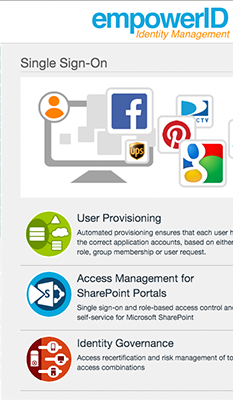
This is our newest version of the company website that should be coming out in the next few weeks. Designed and implemented by me. Responsibilities included design, graphics, HTML, and CSS.
http://www.empowerid.com
http://www.empowerid.com
The Brief:
The company site redesign was done to reinvigorate the companies image and align design and content to compete with other competitors online presence. Met with owner and sales team to come up with examples and to figure out best direction to level out chances to improve sales by simplifying product information.
Challenges:
Some of the challenges were to simplify the information into more digestible chunks of information. Also tasked with that was to provide illustrations that would better communicate and enhance the experience for the reader to better inform them of the products abilities and how they will be able to use the product to better enhance their companies performance.
Design Phase:
During the design phase we decided to put the content into sections with wide areas of blank space so the reader did not have to get overloaded with other information. We also concluded that by having a larger navigation we could actually provide the reader with quick information that might give them a chance to review the products with out diving into heavier information.
Implementation:
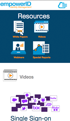
My role in implementing the site was to provide all HTML, CSS and illustrations. Teaming with the developer to set up the project solution I was able to add HTML pages as needed and associated materials such as PDFs and videos. Also with implementing the design I made sure all screens looked good on mobile devices such as phones and tablets using media queries to adjust the CSS as needed. This site was built on the Bootstrap framework.
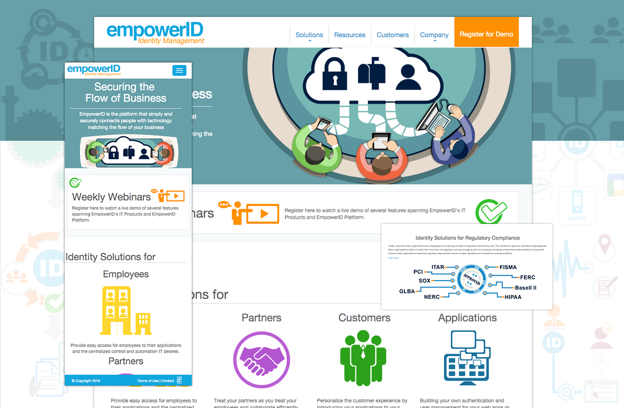
empoweID's website

